Uruguay Outfitters: a fast, cinematic website for a luxury lodge
 Jul 16, 2026
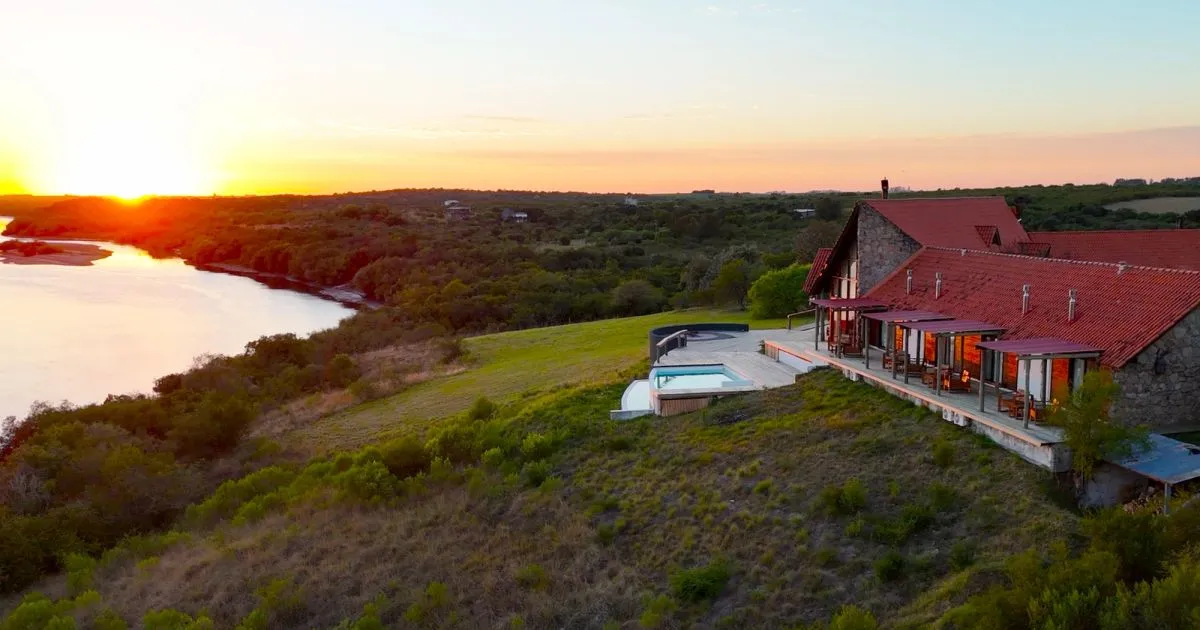
Uruguay Outfitters sells a week of hunting and fishing to people who have never seen the place and won’t see it until they’ve already paid to get there. The photographs have to do the selling. The site has to load before somebody on a hotel wifi gives up. And nobody at the lodge should have to call me to swap a picture.
I designed and built it in 2026: the design first as a WordPress mockup, then the real site in Next.js, built with Claude Code and deployed on Vercel. This is the top-level version of what it runs on and why, without the client’s private details.
$ git push origin main
vercel · building uruguayoutfitters.com
✓ ready · production
Selling something the buyer can’t inspect first
That’s the actual problem, and everything else follows from it.
A lodge is not a product you can try. The guest is booking a trip to another country on the strength of some photographs and a feeling about whether these people seem competent. The photographs are not decoration on this site. They are the inventory. Anything that makes them slow, or small, or badly cropped is taking money off the table.
The second constraint is the team. It’s small, and none of them are developers. A site that requires a developer for every seasonal update is a site that goes stale by March, and a stale site on a seasonal business reads as a closed one.
One job, kept narrow
The site has one job that matters: turn an interested visitor into an inquiry. So it stays narrow. One clear path to a contact form, no popups, nothing else competing for the click. Everything on the page is there to support that step or to get out of its way.
TAKEAWAY: decide the single thing a site must do before you choose anything else. The stack is easier to pick once the job is clear.
What it runs on, and why each piece
Next.js and React build the pages. Most of the site is generated ahead of time as static files, so it loads fast and costs almost nothing to serve. The parts that change, like the journal, refresh on their own on a timer without a full rebuild. Plain version: the pages are pre-baked, and the few that go stale re-bake themselves.
Tailwind handles styling. The rules live right in the markup with one shared scale for type, color, and spacing, so the look stays consistent and there’s no separate stylesheet drifting out of sync.
Vercel hosts and deploys it. I push the code, Vercel builds it and puts it online across a global network, close to whoever is loading it. Every change gets its own preview link before it goes live.
Resend sends the inquiry email. The form hands the message to it, and it lands in the lodge’s own inbox, where they reply as themselves.
Who gets to change things without calling me
Sanity holds everything the team needs to edit: photo galleries, the journal, seasonal details. They change it in a simple studio and the site reads it at build time. No deploy to swap a photo.
That one is worth pulling out of the list, because it isn’t really a technology decision. As I said on my own build, a CMS is a decision about who is allowed to change what, without asking anyone. Pick wrong and you’ve made yourself a permanent dependency for a business that just wants to post this season’s photos. I’d rather ship something they own.
TAKEAWAY: every tool you choose for a client either hands them control or quietly keeps it. Know which one you’re doing, and do it on purpose.
The work is in the parts nobody sees
The homepage looks simple. Most of the decisions behind it are things you can’t look at.
Images. This is a site made of photographs. Left alone, a phone would download a picture sized for a desktop screen. So every image is resized and converted to a modern format on demand, at the exact width the device asked for, then cached. The visitor sees nothing different. They just see it sooner.
Delivery. A contact form is worthless if the inquiry lands in spam, or if the reply does. Getting mail to pass a domain’s strict anti-spoofing checks, so a reply reaches the guest’s own inbox, was more work than the form itself.
Reading. The audience skews older. That set hard floors on text size and color contrast, checked against accessibility standards rather than taste. A color that looked right on a dark photo failed the contrast test on a light panel, so it didn’t ship there.
The decisions, on the record
| DEC | Decision | Status |
|---|---|---|
| DEC 001 | Next.js with React, mostly static pages, timed refresh for content that changes | SETTLED |
| DEC 002 | Tailwind for styling, one shared scale, no separate stylesheet | SETTLED |
| DEC 003 | Vercel for build, deploy, global delivery, and a preview per change | SETTLED |
| DEC 004 | Sanity headless CMS so the team edits content without touching code | SETTLED |
| DEC 005 | Resend for inquiry email, replied from the lodge’s own inbox | SETTLED |
| DEC 006 | On-demand image optimization plus correct sizing for a photo-heavy site | SETTLED |
| DEC 007 | Accessibility floor on contrast and type size for an older audience | SETTLED |
What carries over
If you build sites, the transferable part is this. Pick the one job first, and the stack falls into place around it. Then ask which of your choices hands the client control and which ones keep you in the loop forever, because that answer outlives every framework on the list.
And most of your real work will land in the parts nobody notices: the picture that loads in time, the mail that arrives, the photo the owner swapped without calling you.
Everything the visitor praises sits on top of the work they never see.